Sunday, January 31, 2010

Remaking SRC Holdings

I was first introduced to Springfield ReManufacturing Corporation (SRC) in an Inc. interview with its Founder and CEO, Jack Stack. The article focused on the practice of open book management and how his methodologies allowed him and a group of managers to take a failing company and turn it into a powerhouse over the course of nearly three decades. I subsequently read his book, "The Great Game of Business", a must read for anyone who takes their business, and the livelihoods of their employees, seriously. After you get past the "wow" factor, it just makes sense.

As a designer, I find myself in search of that "wow', the thing that makes an image or a brand stick. There is no doubt that SRC Holdings has it in spades in terms of their day-to-day functioning. But where is it in their branding? The chromes and metallic shines of their current family of logos veer towards cliche. They are one-liners that speak very literally to a multi-dimensional audience. One other thing their branding fails to do is to speak of their currency in the market. It doesn't say, "Welcome 2010 and beyond."

Staying power is important, and SRC has no exit strategy, no plans to sell off their assets and put their workforce to pasture. What is relevant are all of the elements that make their company unique. Machinery, longevity, integrity and environmental responsibility all spill forth from what and how they operate. That's a recipe anyone starting out should be eager to adopt and a trend that anyone who's been around for awhile should be eager to follow.

While you can't put a diesel engine on a grocery store shelf, you can still think about your shelf appeal. What is your brand saying when you're not there? And what will it say in another 30 years when your legacy passes to the next generation?


Sunday, January 24, 2010

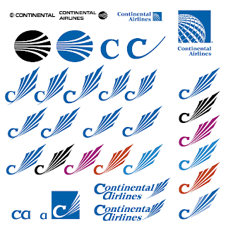
Remaking Continental Airlines

What started as an airmail and passenger service in 1934, Continental Airlines celebrated its 75th anniversary in July 2009. To mark the day, they rolled out a 737 painted as a circa 1958 livery, but didn't seize the moment to review the brand on the table. Their meridian-demarcated globe has graced the tails of their planes for nearly 20 years now. As globes and all things global go, it is a strong runner, but Continental's 1968 jet-stream predecessor, five simple white curves cut into an oval, was a more forceful, and far less generic, stamp and statement.

A global leader in the airline industry requires such a statement. In this case, referring back to Continental's own strong identity and allowing it to evolve could also speak to a confidence in their products and services. Besides that, a globe, while it may weakly allude to connectedness, does not on its own invoke the core of what Continental does. That is why it must always paired with their name, so that the point is forced.

Yes, thanks to more affordable airfares, the world is getting smaller. But show us that strong leader that flies planes and has been doing it, and doing it well, since our grandfathers cut their first teeth.

Why reinvent the wheel when, in this case, the wheels were already on the tarmac?


Saturday, January 16, 2010

Remaking Kraft Foods

In February of 2009, Kraft Foods unveiled a new logo to take their brand beyond the staid red and blue. It is fair to order a face-lift to mark the 100th year after their founding, but they swung the pendulum far from their world-recognized branding. Their rebrand is much the flavor of the month: explosion of color, shapes, gradients, lower case. It's very web 2.0, in the vulgar sense, but will it survive another fifty years?

Middle-ground alternatives can be explored, banking on the recognition they have in hand and coupling it with the flavors of their range of sub-brands.

Kraft could retain their history while appearing current, playing with their palette and exploiting the visual cues that distinguish them as Kraft, namely their stylized lozenge and bold capital type.


Sunday, January 10, 2010

Remaking the Hudson Group

If you do any traveling in the United States, you may have come across the Hudson Group.  They are the owners of the Hudson News family of newsstands where you can browse and buy newspapers and books while you wait for your connections in airports and train stations. About a year ago, I was thinking of approaching them for a brand face-lift, but found that they had recently been acquired, so decided to step back and see what happened.

A year on, their website has received an overhaul, but their old logo is yet in place (see it below, top left).

The Hudson Group has built a lot of equity in the Hudson News brand over the years. Why not carry that over into the corporate identity?


Sunday, January 3, 2010

What If? The Brand Doodle Genesis

I simply ask, "Can we improve the brand landscape of business X?" They're out there, and I'm coming to get 'em.