Thursday, August 30, 2012

Corps That Care

I'm happy to be witnessing a new trend in corporations, the B Corp, 'B' standing for Benefit. Accountable to all.

And thanks to popular B Corps like Warby Parker and Patagonia, coupled with state legislation (US), the B Corp movement is gaining traction.


I'd like to see all corporations dig in full 360, not just pay lip-service to sustainability and accountability (and other -abilities).

Let it be.

Tuesday, October 18, 2011

Good Business Sense: Word-of-Mouth

I'm no genius. I don't have an MBA. No PhD in Psychology. I took the long track via education and practice through the back door of design and marketing.

But then, what I propose here doesn't take much to understand. It is basic math and human relations.

Let's assume that every customer that calls or walks through your door represents twenty people. We'll call those people a circle of influence. For every person that walks through that door is an opportunity to reach twenty more. And if you handle that customer with care, if you treat them like partners rather than dollars, then your Return on Investment (ROI) is exponential.

Don't take my word for it. There are countless studies and analytics to back this up. Word-of-mouth marketing has been a huge buzz in the last five years and accounts for brands backing up the trucks to Facebook and Twitter and asking scores of non-celebs to like and follow them.

An Intelliseek (now Nielsen Online) study of 2005 found that consumers were "50% more likely to be influenced by word-of-mouth recommendations from their peers than by radio/TV ads." That means that your media spend, whether tens or millions of dollars, is a good deal less important to the growth of your business than that single customer standing in front of you.

Most people know this, but few practice it. We've been swimming in a sea of disparity for a few years now that has people pointing their fingers at big business as a devil worth toppling. I'm on their side. Businesses are not human beings. They don't feel anything but the pinch of their stockholders' votes, and the stockholders are constantly asking for more. That compels the inhuman machine to steamroll the universe at any cost, including the lives and livelihoods of the very people they count as customers. That monster is part of what the Occupy Wall Street movement is protesting. They're mad as hell, and they're not going to take it anymore.

But maybe you're just a mom and pop shop, selling goods to the neighborhood. Or maybe you're a mid-sized company trying to balance growth and attrition, employees and their benefits, overhead and bottom-line expansions. You didn't sign up for this life and it's hardships, but if you don't fight tooth and nail, you'll sink like a stone.

Whoever you are, remember that your greatest asset is that guy standing in front of you. He votes. He has friends and colleagues and acquaintances. He's also on Facebook and Twitter and emails his sister twice a week. How you handle your relationship to the guy in front of you can make or break you. And the avalanche you start can either help or hinder your community. That plays in everyday relationships, both personal and public.

The original reason I bring this up is that my graphic design students are having issues with printers. The printers here reason that they cannot do small runs because the ten dollars they stand to gain is not worth the trouble. What they fail to calculate, the basic math of it, is that each satisfied student will bring in twenty more. That's ten dollars times twenty, or two hundred dollars. And all of those students will come back again and again and send their friends. And they will all potentially become lifetime customers as they move into the workforce and establish themselves as creative director and perhaps some day the CEOs of major corporations all needing the services of a printer.

This is your chance to contribute to building community. And if it's all done right, everyone in the equation is treated equitably so that the common man, the every man, has a voice and a vote.

Get it? Got it? Good.

Saturday, October 8, 2011

Book Reviews: Linchpin vs. Getting Real

I have become a fan of Seth Godin, not because he is a genius, but because he gets off his duff and does something. Or says something, as it were. In his words, he 'ships'. A lot.

With that marginal fandom in tow, I eagerly picked up Linchpin (Do You Zoom, Inc, 2010) hoping for some of that good old-fashioned how-to to get me off my own duff. And ship.

One chapter sticks out, and I shared it with my students. 'Becoming the Linchpin' is great advice for young people about to stick their necks out into the workforce. Advice on how to get a great job, whether or not you need a resume, and even how to make the Olympic ski team are found therein. The rest of the book, it seemed to me, was a lot of repetition, and I am one who gets things after they have been said once. Maybe twice. Three times a lady? Four, five, six ... you get my point.

The problem with Linchpin, and I don't fault Mr. Godin so much for this, is publishing. Authors get caught in the cycle of publishing or risk becoming irrelevant or the last best thing. No one wants to be the last best thing, so they publish, they pad, the shore up the edges, put a little whipped sugar on top and send it to press.

At least he ships, might go the argument. But in so many words it was too many words.

I favor the 37signals approach. When they set out to publish Getting Real (37signals, 2009)they did it on their terms, and published more of a pamphlet than the requisite 200-page hardbound book. The result is a succinct and direct set of short essays on how to ship. No filler. No meetings about the meetings. They wrote it, published it, moved on.

What's more, it's free. Not that it's the determining factor for reading, but Mr. Godin talks about gifts, given just because, and 37signals delivers them.

To end there might be unfair, but I shall, because I have other things to 'ship' and miles to go before I sleep.

Friday, August 12, 2011

Remaking Capital One Bank: What's in my wallet?

Like a lot of people, I've had a bank account since childhood. My parents took me with my handful of savings to get a passbook to our town bank to help teach me about saving and the glories of positive cash flow when I was about 8 years of age.

Since then, I've entrusted my handfuls to a number of institutions, big and small, on the assumption that they'd take great and wonderful care of it, investing it in only the most laudable and friendly of places (see my tongue firmly embedded in cheek).

One such fiscal farmhouse was the ubiquitous North Fork Bank (at least ubiquitous enough to have a branch located near my old Brooklyn apartment), which was gobbled up acquired by Capital One in 2006. I'd had a previous relationship with Capital One on the credit card side of their coin some years earlier, so the transition, I hoped, would be easy.

By easy, I mean painless. I hoped in vain that Capital One would improve our branch's service (it didn't).

Then... the signage was installed. Eek.

Why the red swoop/boomerang? Will my money come back to me? Tenfold? The swoop/boomerang has unfortunately adorned many a bad and listless logo for too many years. Search 'logo' and just count them. Go ahead... I'll wait. They are decorations with no purpose, and I was worried when I saw yet another one, big and back-lit hanging over my bank's doors.

Who did they use to design that cliche? I imagined the executive board asking the designer to make it appear 'more dynamic', and the designer (or cousin/sister/wife/teenaged son of the CEO) hesitantly complying. Maybe it was the last straw in a long series of board directed changes, and the exasperated designer threw it in last minute to hush the crowd.

However it went down, that swooshing boomerang is a meaningless artifact that should be removed at once. That brings to bear a redesign. Here are my suggestions for a successful brand-lift:
  • Lose the red boomerang (in case you didn't hear me)
  • Simplify (less is more)
  • Make Big of Small (target a single element of your identity that can represent the essence of your brand)
  • Play through (either get over the hurdles, or leave them behind)
  • Hire competent/experienced staff (how many times can a bank client hear 'oops, sorry' before they worry?)

Saturday, January 29, 2011

5 interviews for a Changing World

To paraphrase Marshall McLuhan, the message is the medium. Start with a great idea, then work from the center outward.

What's your great idea? What's your message? Figure that out, then give it wings.

1. Seth Godin - Author, Linchpin: Are you Indispensable?
http://mashable.com/2010/02/14/seth-godin-linchpin/

2. Blake Mycoskie - Founder, Toms Shoes
http://www.huffingtonpost.com/2010/12/17/creative-minds-2011-submi_1_n_777754.html

3. Tony Hsieh - CEO, Zappos, Author Delivering Happiness


4. Anne and Buckminster Fuller - Visionary Architect, Philosopher, Designer
http://www.salsburg.com/flyseye/flyseye.html

5.  Bruce Mau - Designer, Author Massive Change
http://www.worldchanging.com/archives/004950.html

Sunday, June 20, 2010

Remaking EnerSys

One of the five tenets of Khol Design is "Primum non nocere", Latin for "First, do no harm." It is an ethical maxim taught to medical students worldwide and I believe it is a good principle to live by. That is why I have been torn for some time about posting this particular edition of brand doodle.

You see, EnerSys is a global leader in stored energy, i.e. batteries, for nearly every industry under the sun. A visit to their website reveals that they design, manufacture and supply batteries to light and heavy vehicles, reserve supplies for critical systems such as hospitals, and batteries for the aerospace and defense industries worldwide. Did I mention the defense industries? Yes, I did.

I have often rethought what I have posted so as not to close the doors on opportunities. But I've realized that this is rubbish. One's ethics lie in the integrity of their delivery. What, if not our declarations and consequent actions, will attest to what and how strongly we believe?

And this is why I've decided to revisit this logo and use it as a case to touch upon the ethics of design.

Here's the story:
Nearly a year ago, on one of those commutes to NYC that I've mentioned before, I made a brief list of logos I spotted that needed some TLC. EnerSys made that list and when I looked them up several months ago, I was disappointed to find them immersed in defense and aerospace. They have created batteries for the F-18 Hornet, F-117 Stealth, Commanche and Apache helicopters, Harrier, Osprey, Blackhawk, F-16 and B-52, to name a few, and are hawking a battery called Armasafe Plus™ that, according to a downloadable PDF, is "Quite Possibly the World's Best Battery for Combat and Tactical Vehicles."

Now, if they were designing and manufacturing batteries for electric cars and selling the world on the necessity of renewable energy sources to power them, that's one thing, but I would have to return a resounding "No" to anyone asking me to apply my skills to anything delivering bombs to my neighbors.

You see, when I was of conscription age, former President George Herbert Walker Bush decided to declare war on Iraq for moving into Kuwait. I'll let you draw your own conclusion as to the why of the matter, since you've got Google at your fingertips.

My ethics prevented me from supporting the war, and my reaction was to stand my ground as a conscientious objector. I lost a few friends and really upset others with this decision, but I stuck to it because my conscience wouldn't allow any divergent conclusions. It was a guiding principle, and nineteen years on, through university, the workforce, graduate school and my career as a designer, that guiding principle remains.

So EnerSys, if you're listening, here's the offer: If you stop catering to the destruction of other nations, harming man, beast and environment, and instead focus on sustainable energy for life-supporting enterprises, then give me a call. As you can see from the below, I have dreamt up a few choice new logos and would be happy to discuss your re-branding and repositioning strategies.

Or perhaps not, since you can't unbomb a village in Afghanistan.

Lose a few friends, upset a few others. The alternative is more perilous, for, as Alexander Hamilton put it, "Those who stand for nothing fall for anything." And the fall from your guiding principles is high and hard.

What are your guiding principles?


Friday, April 23, 2010

Remaking NEMF

The morning commute affords me the time to sit back, relax and take in the scenery. It is also a time to observe, and I, like so many other creatives, am an ardent observer. People watching, watching the waves roll in, the grass grow. But at some point, one jumps in to intercede, interact, sketch, ponder and rearrange the furniture. Looking is not enough.

I have borne witness to NEMF for many years now, crisscrossing the highways and interstates of the U.S., loaded with the mysteries of a small universe. On a bus into New York one morning, I observed their logo and made a note to visit it.

A visit to their website reveals them to be New England Motor Freight, one of a family of transport, logistics and warehousing companies belonging to the Shevell Group of Elizabeth, New Jersey. While their family branding is not off the mark, it could take fuller advantage of the strength of the whole, with attention paid to a more unified and contemporary feel.

Many companies suffer through growing pains, introducing a larger range of services into the fold and often acquiring other companies to fill the gaps. It is often enough of a task to keep the engines running and everything moving forward. But when the dust settles, it is also good to look back, count your strengths and weaknesses, and readapt the whole to reflect on where you are in the here and now.

Friday, March 19, 2010

Remaking Bicycle Depot

It's easy to take on the big guys. They don't have faces, and if they do, they're only staring back at you from a newspaper, magazine or dust jacket. This week, I'm going local.

I recently knocked on a few doors in my hometown to introduce myself and my design services. On this occasion, I met Robert at Bicycle Depot, a local bicycle sales and repair shop. Robert kindly informed me that they didn't need a designer and already had a website, but welcomed me to the neighborhood.

It is difficult to convert people who don't need designers. If I need a shoe, I'll find one myself. Thanks. A lawyer or an accountant? I'll look one up. A bicycle? Easy to find online or in the yellow pages.

Therein lies the problem. When I was a kid, my parents took me to a chain department store to buy a bicycle. Like shoes, they're easy to find, and if you want one cheap and don't want to be hassled by a sales clerk, you can anonymously get one just about anywhere. If you really want to avoid the icky experience of shopping under fluorescent lights, you can get what you want online and have it delivered to your door within a week.

While there have been recent trends to shop locally, online and department store sales are undercutting the locals so significantly that it has created a no compete situation. In sales, you either win with the lowest price or with quality. It's the quality that keeps the local shops alive, the personal service, and the pride of knowing you're supporting your community by filling the tills of the people who bed down in your neighborhood.

And while quality is a real thing, delivered from one hand to another, it is also a perception. Why do the big box stores win so many hearts? They are big and shiny and polished. They enter your living room during commercial breaks and tell you they care. Again and again.

I'm not advocating the force-feeding of a bill of goods to the masses, but I do suggest that every small business owner take a good look at their image. When I was in high-school, I was out with a group of friends. One girl was asked what was the first thing she looked for in a guy? "His shoes," she answered. "You can tell a lot about a guy by how he keeps his shoes."

Circling back to Bicycle Depot: Why not polish your shoes and perhaps turn a few more heads and feet towards your door?

Wednesday, February 17, 2010

Case Study: Remaking LPA Construction

One of the best things about my job is helping people realize their goals. Branding is an investment in making a dream something tangible.

After over 30 years in business, I was approached by the son of the founder of LPA Construction to help reposition them to take on larger and more institutional clientele. Sal Lopardo started LPA specializing in masonry and by the time he'd passed it to his son, Anthony, he had built it into a full construction, demolition and hauling company.

When Anthony came to me, he was thinking ahead to the next 30 years and wanted to start with a polished image that spoke to their history, capabilities and quality of service. We sat down together and discussed his father's story as a brick layer turned entrepreneur, the rise of the business over the years, the reliance on word-of-mouth as their primary generator of new and continuing business. We talked about the bidding process for large commercial projects and his desire to not only contend with the competition, but to stand over and above it. We reviewed competitors' brochures and shared what was working for and against them.

After a lot of questions answered and some left open, I set to work on crafting an identity that was at once firm, confident and current. My best method for generating ideas is first to visit the cliches, that massive store of obvious and over quoted imagery that forms the basis of standard clip-art packages. Bricks, hardhats and ladders all played prominently at this stage, as did hammers, saws and every other manner of carpenter's accesory.

The idea is to spit out everything you have readily at hand in order to reach the periphery and beyond to where the interesting ideas live. It was at this point that I was looking at a trowel as an abstract element and hit upon the final design. Three interlocking trowels were fashioned into the three letters of L, P and A. Still too abstract to be recognizable, I added the letters again in a lower-case sans serif font to reflect the geometry of building materials and a modern/contemporary feel.

The success of the logo to me is in its ability to be other things, a stained glass, a scaffold, an A-framed structure, all elements of building. To top it off, my wife penned their tagline "You imagine. We build." We've since carried the logo into the design of all of their stationery, invoices, site signage and soon, a full web site.

The greatest compliment Anthony has shared with me since he began using the logo was the fact that LPA landed a contract because of the very professionalism that was exhibited in their materials. I am honored to have been a part of transforming his vision into reality.

 
After many hours in the sketchbooks


A few of the contenders
 
 The final logo

Sunday, January 31, 2010

Remaking SRC Holdings

I was first introduced to Springfield ReManufacturing Corporation (SRC) in an Inc. interview with its Founder and CEO, Jack Stack. The article focused on the practice of open book management and how his methodologies allowed him and a group of managers to take a failing company and turn it into a powerhouse over the course of nearly three decades. I subsequently read his book, "The Great Game of Business", a must read for anyone who takes their business, and the livelihoods of their employees, seriously. After you get past the "wow" factor, it just makes sense.

As a designer, I find myself in search of that "wow', the thing that makes an image or a brand stick. There is no doubt that SRC Holdings has it in spades in terms of their day-to-day functioning. But where is it in their branding? The chromes and metallic shines of their current family of logos veer towards cliche. They are one-liners that speak very literally to a multi-dimensional audience. One other thing their branding fails to do is to speak of their currency in the market. It doesn't say, "Welcome 2010 and beyond."

Staying power is important, and SRC has no exit strategy, no plans to sell off their assets and put their workforce to pasture. What is relevant are all of the elements that make their company unique. Machinery, longevity, integrity and environmental responsibility all spill forth from what and how they operate. That's a recipe anyone starting out should be eager to adopt and a trend that anyone who's been around for awhile should be eager to follow.

While you can't put a diesel engine on a grocery store shelf, you can still think about your shelf appeal. What is your brand saying when you're not there? And what will it say in another 30 years when your legacy passes to the next generation?


Sunday, January 24, 2010

Remaking Continental Airlines

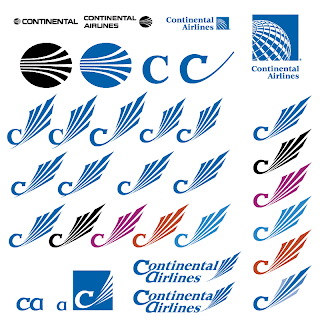
What started as an airmail and passenger service in 1934, Continental Airlines celebrated its 75th anniversary in July 2009. To mark the day, they rolled out a 737 painted as a circa 1958 livery, but didn't seize the moment to review the brand on the table. Their meridian-demarcated globe has graced the tails of their planes for nearly 20 years now. As globes and all things global go, it is a strong runner, but Continental's 1968 jet-stream predecessor, five simple white curves cut into an oval, was a more forceful, and far less generic, stamp and statement.

A global leader in the airline industry requires such a statement. In this case, referring back to Continental's own strong identity and allowing it to evolve could also speak to a confidence in their products and services. Besides that, a globe, while it may weakly allude to connectedness, does not on its own invoke the core of what Continental does. That is why it must always paired with their name, so that the point is forced.

Yes, thanks to more affordable airfares, the world is getting smaller. But show us that strong leader that flies planes and has been doing it, and doing it well, since our grandfathers cut their first teeth.

Why reinvent the wheel when, in this case, the wheels were already on the tarmac?


Saturday, January 16, 2010

Remaking Kraft Foods

In February of 2009, Kraft Foods unveiled a new logo to take their brand beyond the staid red and blue. It is fair to order a face-lift to mark the 100th year after their founding, but they swung the pendulum far from their world-recognized branding. Their rebrand is much the flavor of the month: explosion of color, shapes, gradients, lower case. It's very web 2.0, in the vulgar sense, but will it survive another fifty years?

Middle-ground alternatives can be explored, banking on the recognition they have in hand and coupling it with the flavors of their range of sub-brands.

Kraft could retain their history while appearing current, playing with their palette and exploiting the visual cues that distinguish them as Kraft, namely their stylized lozenge and bold capital type.


Sunday, January 10, 2010

Remaking the Hudson Group

If you do any traveling in the United States, you may have come across the Hudson Group.  They are the owners of the Hudson News family of newsstands where you can browse and buy newspapers and books while you wait for your connections in airports and train stations. About a year ago, I was thinking of approaching them for a brand face-lift, but found that they had recently been acquired, so decided to step back and see what happened.

A year on, their website has received an overhaul, but their old logo is yet in place (see it below, top left).

The Hudson Group has built a lot of equity in the Hudson News brand over the years. Why not carry that over into the corporate identity?


Sunday, January 3, 2010

What If? The Brand Doodle Genesis

I simply ask, "Can we improve the brand landscape of business X?" They're out there, and I'm coming to get 'em.